Watching what users do, not just what you think they'll do can transform your customer experience. And often a tiny tweak can make a huge difference to the bottom line. This is the story of how changing one button found $300M of annual revenue that was being left on the table.
It all started with a company’s purchase experience.
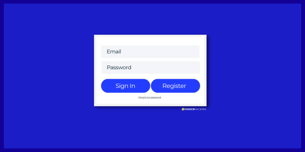
The design was pretty straightforward, with a simple form that asked users to sign in or register to complete their purchase.

Source: Created by Author
The problem? Users were forced to create an account on the site to buy anything.
"They won't mind registering because next time they shop the process will be easier and faster," the design and marketing teams thought to themselves. But when the checkout launched in the real world, it turned out they were dead wrong.
When the site forced people to take precious minutes out of their day to register for an account before buying, they just didn't buy anything. They told researchers, "I’m not here to be in a relationship." 💔
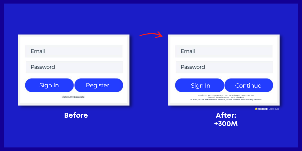
So the user experience team made a simple change:

Source: Created by the Author
Here's what happened when the new design went live:
✅ 45% increase in number of users who completed a purchase.
✅ In this first year, the site made $300M more in revenue.
But why did such a tiny tweak have such a big impact?
It's down to a concept called Friction.
What is Friction?
Friction describes the barriers that stand between a customer and their goals.
❌ It might be asking a user to think too much, overloading the amount of information their brains can handle (Cognitive Load).
❌ It might be asking customers to make a complex choice from too many options, resulting in Choice Overload.
Regardless of the source, friction makes it harder for people to get what they want.
Rethinking our assumptions about what users want and watching what they DO (not just what they SAY they'll do) can help us find opportunities that have been sitting in front of our faces all along.
🚀 Learn what makes buyers tick
Join 8k+ of world's best marketers from brands like Disney, Coca-Cola, Google who are learning marketing psychology in <5 mins a week.
Why Friction Isn't Always a Bad Thing
Although many times friction isn't a good customer experience, not all friction points should be solved. They might create long-term value for the customer, drive desire for the product, or have other (ethical) benefits for the business.
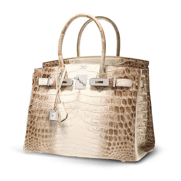
An example of friction working in a brand's favor would be a Hermès Birkin bag. This is a wildly expensive handbag that can cost anywhere from $20k to $300k and beyond.

The Himalayan Croc Birkin, the brand's most expensive piece valued at $432k in 2014.
Birkins might be expensive, but they're in high demand. They have a waitlist that can be up to six years long, and the waitlist itself so exclusive that there's no guarantee you'll even be able to get on it. The brand creates a limited amount of products, they're hard to get, and that can be frustrating for lots of (very well-off) people.
But it's because of those friction points that people want a Birkin - it's what makes the bag the ultimate symbol of status and wealth. The friction in the process is what makes the bag desirable.
The Bottom Line
As we've established, friction can be a positive or negative force depending on its intention. And using it to guide users to the "correct" path or behavior can unlock value (or destroy customer relationships). So we need to use it wisely.
We can start by asking ourselves if a particular point of friction is creating value for the customer in the long-run - even if it's annoying in the moment. Often "good" friction in a user experience includes moments like:
- When users are performing high-risk actions, like entering personal data or confirming shipping information.
- When users are likely to be on autopilot, and need to get their "head in the game" and pay attention to something that's required of them, like taking an action that can't be walked back later.
Introducing more friction in a process can also just be the right thing to do.
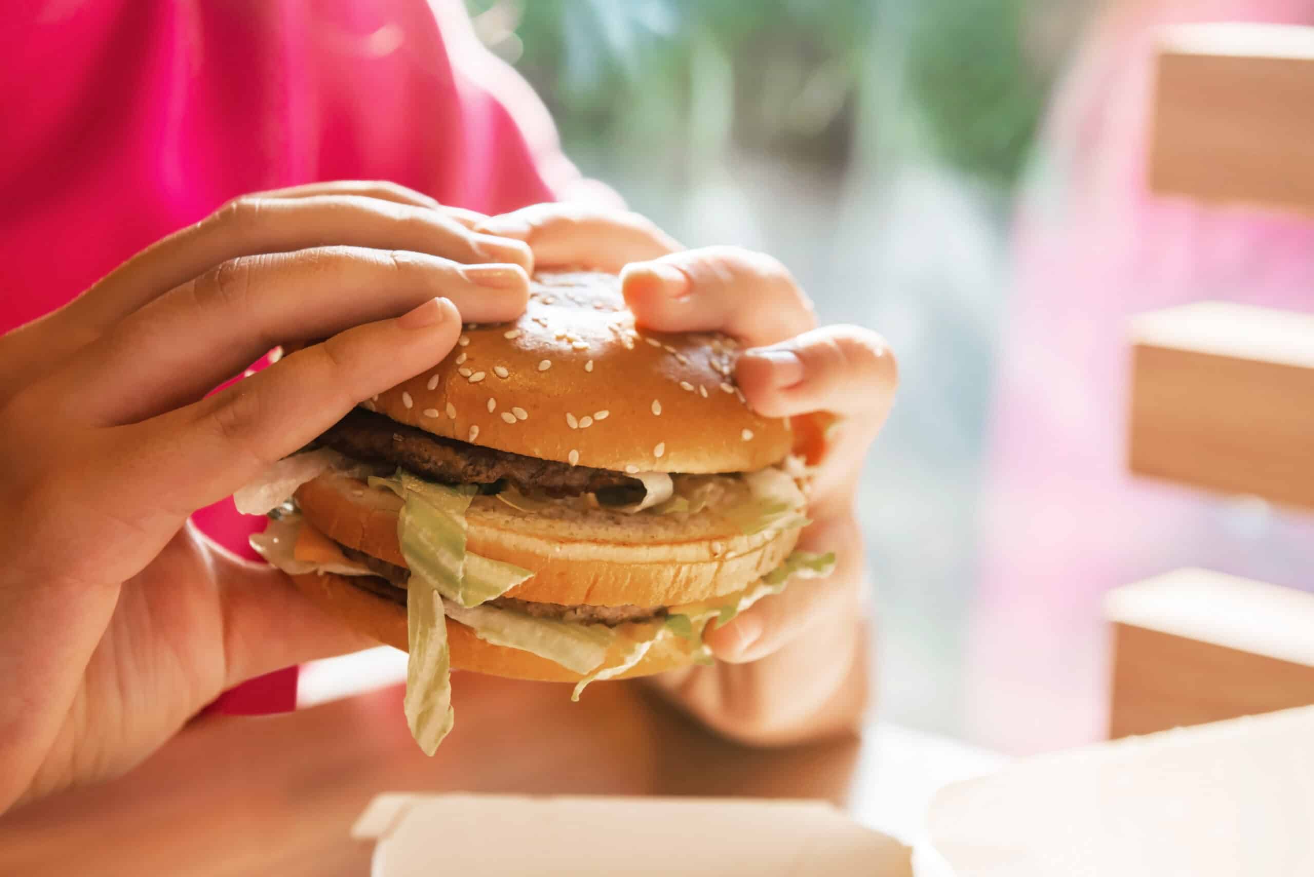
For example, for many years McDonald's would ask customers if they wanted to "supersize" their meals when they ordered - meaning that they'd get an extra-large drink and an extra-large fry with their burger. Because of the pressure of standing in line people were in quick decision-making mode. The brand made it too easy for customers to say "yes" and over-order.
In the early 2000s a more health-conscious McDonald's took the Supersize off the menu and stopped asking customers if they wanted to "supersize" their meals.

To decide if a point of friction needs to be removed, we can start by asking ourselves if there is a point to the user frustration. "Bad" friction might include making what should be a simple process (buying a product) into something that's too long and mentally taxing to have any benefit - as in our $300M button example.
If your users are abandoning carts at a high rate, taking a long time to decide between options, skip onboarding screens (walkthroughs), or quit filling out forms in the middle of a process, it's an indication that these points of friction are "bad" and if fixed would improve the experience for users and the brand's bottom line.
[$300M button story via Web Form Design: Filling in the Blanks, by Luke Wroblewski, paid link]
