Learn what makes your buyers tick👇 

AG1 Athletic Green: “Benefits” Email Psychology Breakdown

minute read

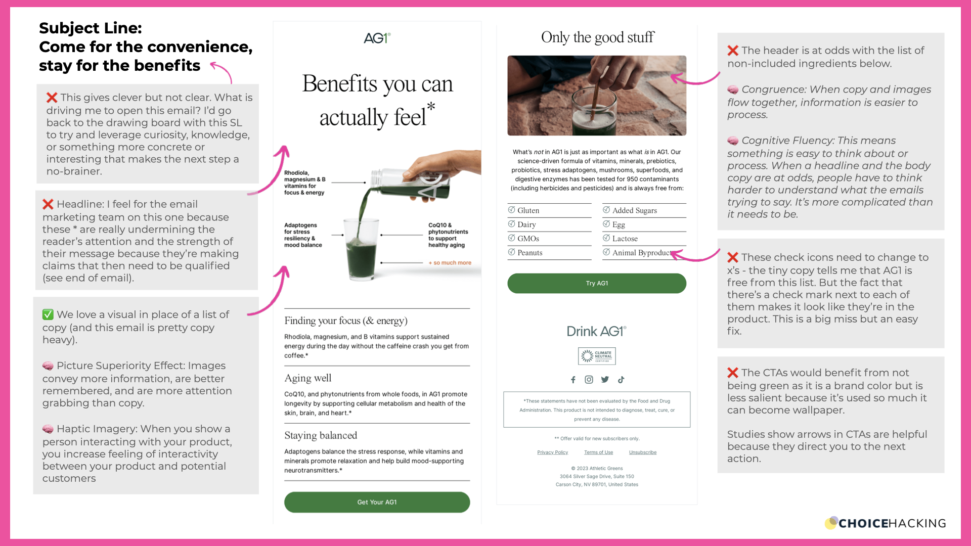
🧠 This education email from AG1 Athletic Greens has a lot to love (and some things I'd change). Here's the psychology behind what works & what doesn't 👇


You can watch the video breakdown below, or keep reading for a summary. 


1. Subject Line

"Come for the convenience, stay for the benefits"

❌ This gives clever but not clear. What is driving me to open this email? I’d go back to the drawing board with this SL to try and leverage curiosity, knowledge, or something more concrete or interesting that makes the next step a no-brainer.


2. Headline

"Benefits you can actually feel*"

❌ I feel for the email marketing team on this one because these * are really undermining the reader’s attention and the strength of their message because they’re making claims that then need to be qualified (see end of email).


3. Header Image 

✅ We love a visual in place of a list of copy (and this email is pretty copy heavy).

🧠 Picture Superiority Effect: Images convey more information, are better remembered, and are more attention grabbing than copy.

🧠 Haptic Imagery: When you show a person interacting with your product, you increase feeling of interactivity between your product and potential customers


4. Second Image

❌ The header is at odds with the list of non-included ingredients below.

🧠 Congruence: When copy and images flow together, information is easier to process.

🧠 Cognitive Fluency: This means something is easy to think about or process. When a headline and the body copy are at odds, people have to think harder to understand what the emails trying to say. It’s more complicated than it needs to be.


5. Checklist Section

❌ These check icons need to change to x’s - the tiny copy tells me that AG1 is free from this list. But the fact that there’s a check mark next to each of them makes it look like they’re in the product. This is a big miss but an easy fix. 


6. CTA

❌ The CTAs would benefit from not being green as it is a brand color but is less salient because it’s used so much it can become wallpaper.

Studies show arrows in CTAs are helpful because they direct you to the next action.


Choice Hacking 3S Framework Score:

🎯 Simple: Is this email easy to navigate - is it clear what I need to do next?


⭐ 3.5/5 This email has a lot of very dense information, but it's well balanced with visuals to explain AG1's benefits and easily scan.


🧠 Salient:
Is this email easy to pay attention to and remember?


⭐ 2/5 Because there's so much information and the header is so general ("benefits") it's difficult to quickly understand and remember any specific details. 


❤️ Soulful:
Is this email easy to love and emotionally engaging?


⭐ 3/5 The personal connection isn't here for me in this email, but that's likely down to the subject matter in the email. An emotional connection could be created and/or improved by seeing real people drinking or feeling the benefits of the product. Right now the only potential human connection is the hand on the AG1 bottle. 


About the author

Jen Clinehens, MS/MBA

Hi 👋 I'm Jen Clinehens (MS, MBA) the founder and Managing Director of Choice Hacking.

I started Choice Hacking in 2021 to help marketers and entrepreneurs figure out what makes buyers tick, and elevate their work using behavioral science, marketing psychology, and AI.

If you want to learn more, check out links to my newsletter, podcast, YouTube channel and other free resources below 👇


Newsletter

🚀 Learn marketing psychology, fast with the Choice Hacking Ideas newsletter.

Lastest Articles

Podcast

Choice Hacking is a top management podcast in 35+ countries that uses storytelling to bring real-life case studies and psychological principles to life.

Listen & subscribe on Spotify, Apple, Youtube

Books

YouTube Channel