Abandoned cart emails can be relentless and boring - but they don't have to be.
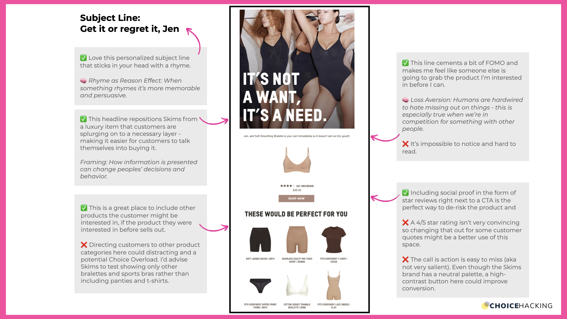
This abandoned cart email from Skims grabs attention and packs a strong conversion punch, supercharged with psychology and behavioral science.
Here's what I think it gets right, a few things I'd change and the psychology behind why.
(I'm using the Choice Hacking 3S framework to guide my analysis):
You can watch the video breakdown below, or keep reading.
1. Soulful: Is this email easy to love and emotionally engaging?
WHAT WORKS:
✅ Love this personalized subject line that sticks in your head with a rhyme.
🧠 It works because of something called Rhyme as Reason Effect: When a saying rhymes it’s more memorable and persuasive.
WHAT I'D CHANGE:
❌ This email isn't creating an emotional connection or getting a reaction from me.
This could be achieved with some small tweaks, for example:
- An image where the models are making eye contact with the user.
- A subheader that says, "These will make you feel like a million bucks."
(Here's an email from adidas that does a good job of creating that connection with humor.)
2. Simple: Is this email easy to navigate and do I quickly know what to do next?
WHAT WORKS:
✅ This email doesn't overwhelm - the CTA to "shop now" is clear.
WHAT I'D CHANGE:
❌ I'd recommend testing the products in the "this would be perfect for you" section.
Experimenting with an email that shows all bralettes (since that's what the customer was shopping for) instead of a mix of t-shirts, panties, and body suits might keep the customer focused on their original shopping mission, making them more likely to complete their purchase.
3. Salient: Is this email easy to notice, pay attention to, and remember?
3. 🧠 Salient: Is this email easy to pay attention to and remember?
⭐ ⭐ ⭐ ⭐ -Not bad but needs a small tweak to make it 5 stars
WHAT WORKS:
✅ The basic design of this email is easy to navigate and familiar to customers.
WHAT I'D CHANGE:
❌ The salience of the CTA button (how attention-grabbing it is) could be much higher - it's easy to lose because the Skims brand is very neutral, resulting in a CTA that's low contrast and easy to miss.
Dialling down the nude to a darker shade (dark brown or black) with white text would make it easier to spot among all the neutral products and images.

